
Market structure insight generated from Savior’s internal research process. Data through 2026-07-07.
Most investors look at the headline index return first. That makes sense, but it can also be misleading. A market-cap-weighted index like the S&P 500 gives the largest companies the most influence. When the biggest companies rise, the index can look healthy even if the average stock underneath is not participating.
That is why Savior looks under the hood. We compare the cap-weighted market, equal-weight market, leadership concentration, sector behavior, new highs and lows, and moving-average participation. The goal is not to predict every short-term move. The goal is to understand whether the market is being lifted by broad participation or by a smaller group of dominant stocks.
Market Movers Summary
| Estimated cap-weighted return | -0.35% |
| Estimated equal-weight return | -0.05% |
| Top 50 contribution | -0.290 percentage points |
| Bottom 450 contribution | -0.064 percentage points |
| Est. S&P 500 market cap | $73.09T |
| Latest nominal GDP | $31.82T |
| S&P 500-to-GDP proxy | +229.7% |
Savior’s Take: The key lesson is that headline index returns can hide important differences beneath the surface. Breadth, concentration, new highs/lows, moving-average participation, and sector leadership help show whether a rally is broad or narrow.
Market Movers Snapshot
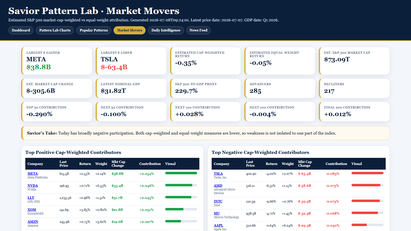
The snapshot below comes from Savior’s internal Market Movers view. It shows how the S&P 500’s return was distributed across the largest companies, equal-weight participation, market-cap gainers and losers, and the top positive and negative contributors.
Yesterday’s market structure: rotation beneath the headline
The most useful read from yesterday was not just whether the index was up or down. It was who moved it.
Based on the latest attribution run, the top 50 S&P 500 companies contributed -0.290 percentage points, while the bottom 450 contributed -0.064 percentage points. In plain English, the largest companies were not the only story. The lower-ranked 450 names were positive in aggregate even though several large semiconductor and mega-cap names were meaningful drags.
That matters because markets have become more volatile recently. Two weeks ago, the tone was much more constructive. Last week, the Nasdaq fell roughly 4.5%. Over the last couple of sessions, the market bounced again. Those quick shifts are exactly when breadth, equal-weight participation, and contribution analysis become more useful than simply asking whether the S&P 500 finished green or red.
When leadership flips quickly from mega-cap strength to mega-cap weakness, and then back again, it can create a market that feels healthy one day and fragile the next. The answer is not to overreact to every move. The answer is to look under the hood and ask whether participation is improving or narrowing.
Who actually moved the market?
The table below groups the S&P 500 by approximate market-cap rank. This helps show whether the market’s return came from broad participation or from the largest companies carrying the day.
| Market-cap group | Estimated contribution to the cap-weighted index move |
|---|---|
| Top 50 S&P 500 companies | -0.290 percentage points |
| Next 50 companies | -0.100 percentage points |
| Next 100 companies | +0.028 percentage points |
| Next 100 companies | -0.004 percentage points |
| Final 200 companies | +0.012 percentage points |
Largest positive contributors
| Name | Return | Est. weight | Contribution | Market cap change |
|---|---|---|---|---|
| META Meta Platforms |
+2.55% | +2.14% | +0.054 percentage points | $38.8B |
| NVDA Nvidia |
+0.71% | +6.53% | +0.046 percentage points | $33.4B |
| LLY Lilly (Eli) |
+2.96% | +1.51% | +0.045 percentage points | $31.7B |
| XOM ExxonMobil |
+3.85% | +0.80% | +0.031 percentage points | $21.8B |
| AMZN Amazon |
+0.75% | +3.62% | +0.027 percentage points | $19.6B |
| JNJ Johnson & Johnson |
+3.05% | +0.88% | +0.027 percentage points | $19.0B |
| MSFT Microsoft |
+0.54% | +3.95% | +0.021 percentage points | $15.6B |
| CVX Chevron Corporation |
+3.52% | +0.47% | +0.017 percentage points | $11.8B |
Largest negative contributors
| Name | Return | Est. weight | Contribution | Market cap change |
|---|---|---|---|---|
| TSLA Tesla, Inc. |
-4.02% | +2.07% | -0.083 percentage points | $-63.4B |
| AMD Advanced Micro Devices |
-6.51% | +1.15% | -0.075 percentage points | $-58.6B |
| INTC Intel |
-9.66% | +0.76% | -0.073 percentage points | $-59.4B |
| MU Micron Technology |
-4.71% | +1.45% | -0.068 percentage points | $-52.4B |
| AAPL Apple Inc. |
-0.64% | +6.24% | -0.040 percentage points | $-29.4B |
| AMAT Applied Materials |
-6.46% | +0.60% | -0.039 percentage points | $-30.4B |
| LRCX Lam Research |
-6.87% | +0.56% | -0.038 percentage points | $-30.1B |
| KLAC KLA Corporation |
-7.22% | +0.39% | -0.028 percentage points | $-22.0B |
Why this matters
When cap-weighted and equal-weight measures disagree, the market is telling us something important. It may mean the largest companies are carrying the index. It may also mean the average stock is improving beneath the surface even while a handful of large names are dragging down the headline.
In a healthier advance, we typically prefer to see more stocks participating: more new highs than new lows, more stocks trading above their 50-day and 200-day moving averages, and sector leadership that is not limited to only a few mega-cap names. Narrow leadership can last longer than expected, but it can also create fragility if the leaders begin to stall.
This is one reason Savior built an internal research tool we call Pattern Lab. Pattern Lab helps us monitor market structure, technical patterns, leadership, breadth, and divergences. It is not a stand-alone trading signal and it is not a recommendation engine. It is a research cockpit that helps us ask better questions.
What Pattern Lab is designed to watch
- Leadership concentration: Are the largest companies driving most of the index move?
- Equal-weight confirmation: Is the average stock confirming the headline index?
- Market breadth: Are more stocks making new highs or new lows?
- Moving-average participation: What percentage of stocks are above key trend lines like the 50-day and 200-day moving averages?
- Technical patterns: Are indexes, sectors, or themes forming constructive bases, broadening patterns, exhaustion structures, or divergence warnings?
- Risk context: Does the current market reward adding risk, holding steady, or waiting for a better opportunity?
What this does — and does not — mean
This type of work is not about calling every market top or bottom. It is about recognizing when headline returns are being driven by a narrow part of the market, when participation is improving, and when the internal structure is becoming more volatile.
The goal is discipline, not prediction.
The bottom line
the market being “up” is not always the same as the market being broadly healthy. Sometimes the top of the index carries the load. Other times smaller companies, sectors, or equal-weight indexes begin to outperform and reveal improving participation under the surface.
That distinction matters for portfolio construction, risk management, and opportunity identification. Savior’s Compass and Pattern Lab process is built to help separate headline noise from deeper market structure.